Logo use
- Primary logotype
- Additional lock-ups
- Minimum sizes
- Clearspace
- Web usage
- Print usage
- Additional examples
- Downloads
The Shorelight logo is central to the brand and must appear on every communication. The Shorelight logo system is comprised of a logotype and logomark that can be used in tandem or individually.
Primary logotype
The Shorelight logotype is the primary brand mark and should be used on all communications including presentations, marketing communications, and advertisements.
Additional lock-ups
There are two logotype lock-ups and each is intended for specific use-cases as outlined. When in doubt, please use the primary logotype.
There are two logomarks and each is intended for specific use-cases as outlined.
logomark
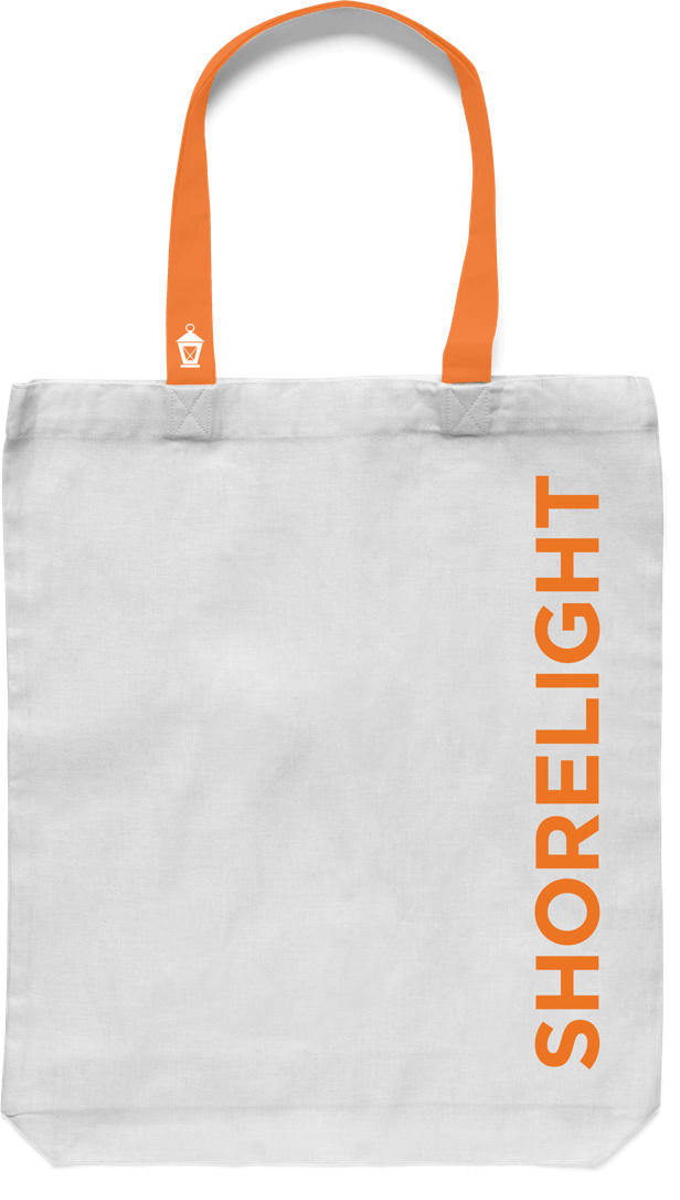
The lantern is a secondary mark that can be used to support the Shorelight logotype on communications and promotions.
Minimum sizes
To ensure legibility, the logo cannot be displayed smaller than the outlined minimum size constraints.
Primary logotype
Minimum print size
.4 inches (wide)
Minimum web size
65 pixels (wide)
lantern
Minimum print size
.3 inches (height)
Minimum web size
20 pixels (height)
Clearspace
The logotype shouldn’t be placed too close to other design elements. Please use the height of the uppercase “O” as clear space on all four sides of the logotype.
Web usage
navigation
The Shorelight website navigation uses the primary logomark on all pages. The logo is not repeated on text content areas of the site or over images.

Footer navigation
The Shorelight website footer uses the supporting lantern logomark.
Print usage
printed materials
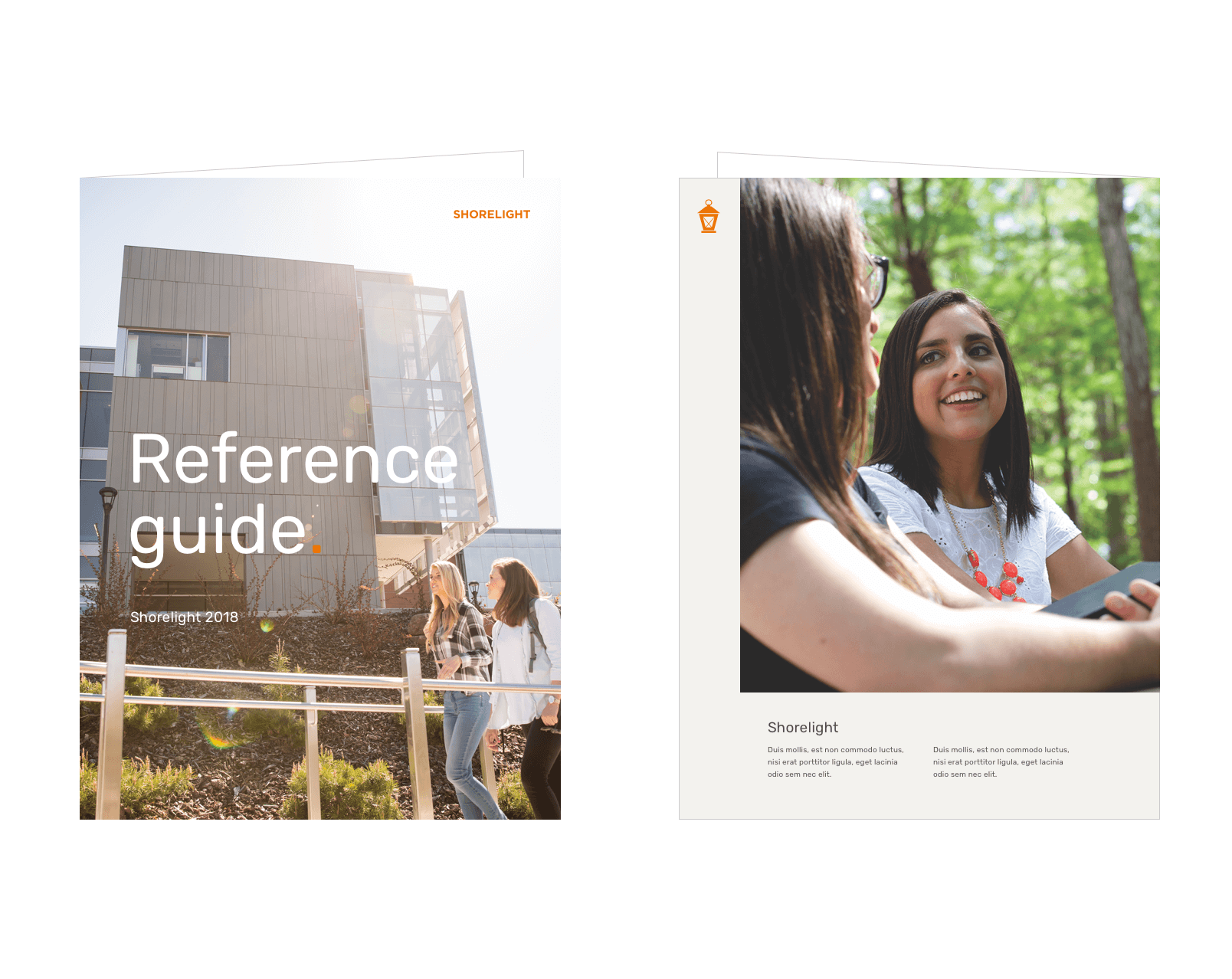
The primary logo should be used on the front cover of all print materials. The logo must always appear in the top or bottom corners. Be mindful of legibility when used over an image.
The lantern logomark may be used as an accent on back covers of print materials.

Additional examples

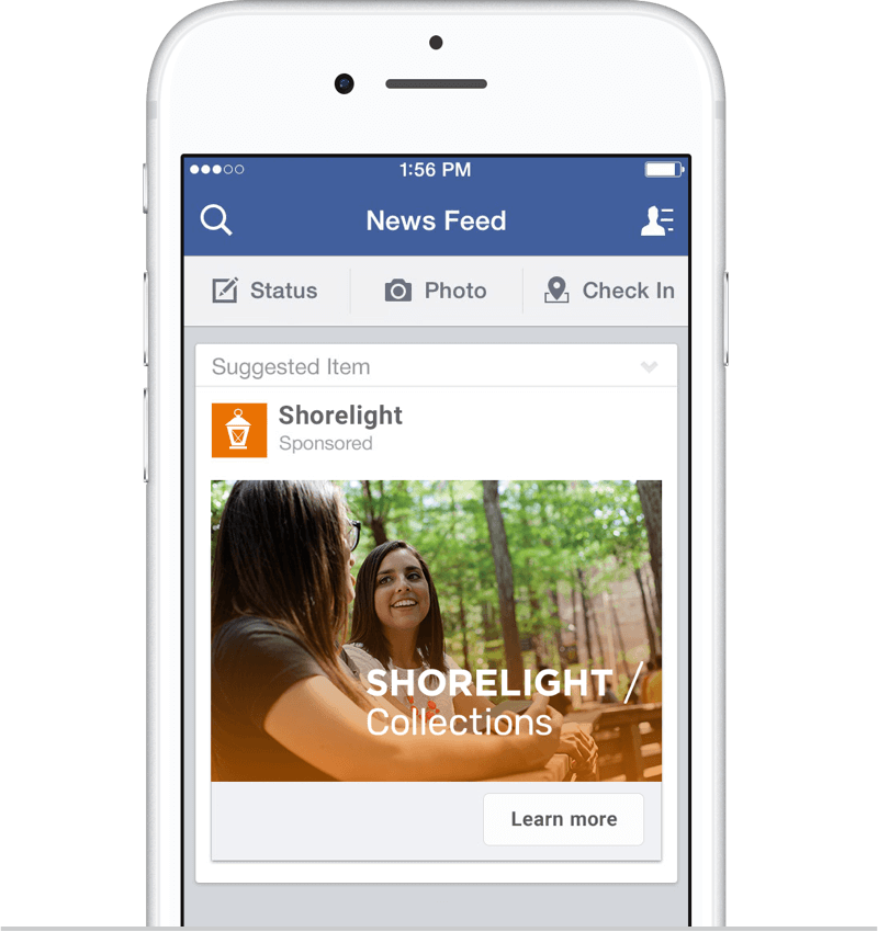
Bottom of advertisement


Downloads
Shorelight logo assets are available on Widen.
Download Logo Assets