Typography
A simplified type system ensures consistency across the Shorelight brand. Typefaces have been selected to complement the Shorelight logotype. They are open-source, which makes them easier to use and distribute across an international marketing team.

Overview
The signature Shorelight typeface is Rubik, an open source typeface available on Google fonts. Rubik is warm, distinctive, and legible across mediums.
Download Rubik
The secondary typeface is Merriweather, also a Google open source typeface. It may be used to complement Rubik in elements such as callouts, quotes, and testimonials.
Download Merriweather
How to use type
Headline
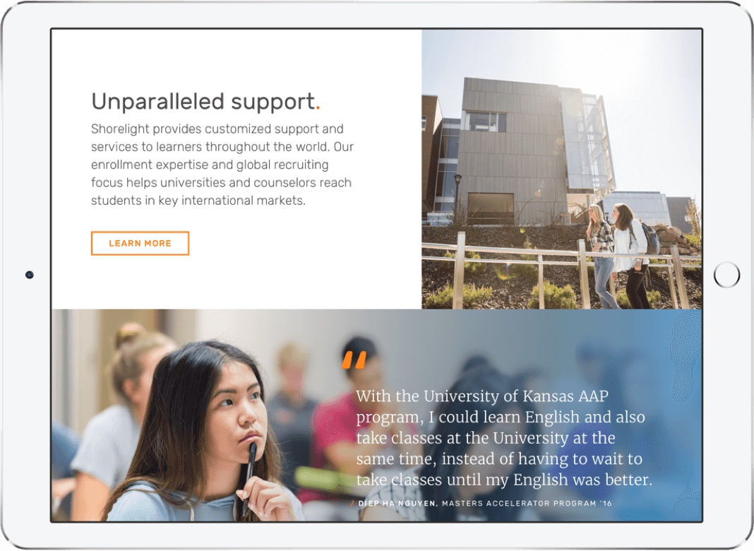
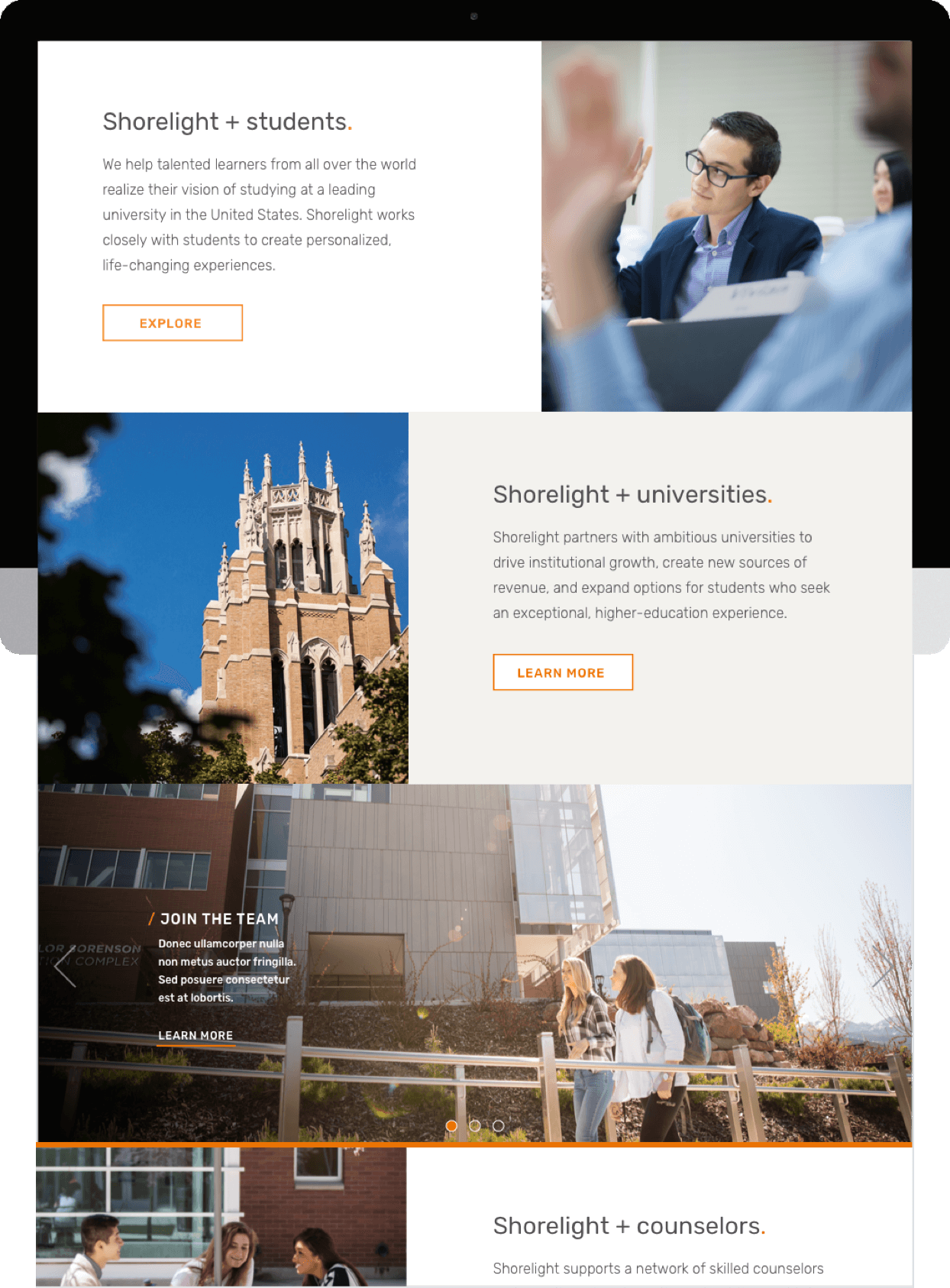
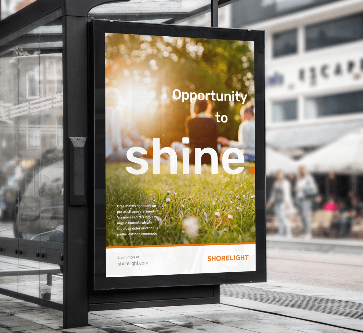
Rubik, regular weight, works well as headlines for emphasis. This should be the largest type on the page or screen, set in the primary brand dark gray on a white or neutral background color. Avoid placing type over faces.
Subhead
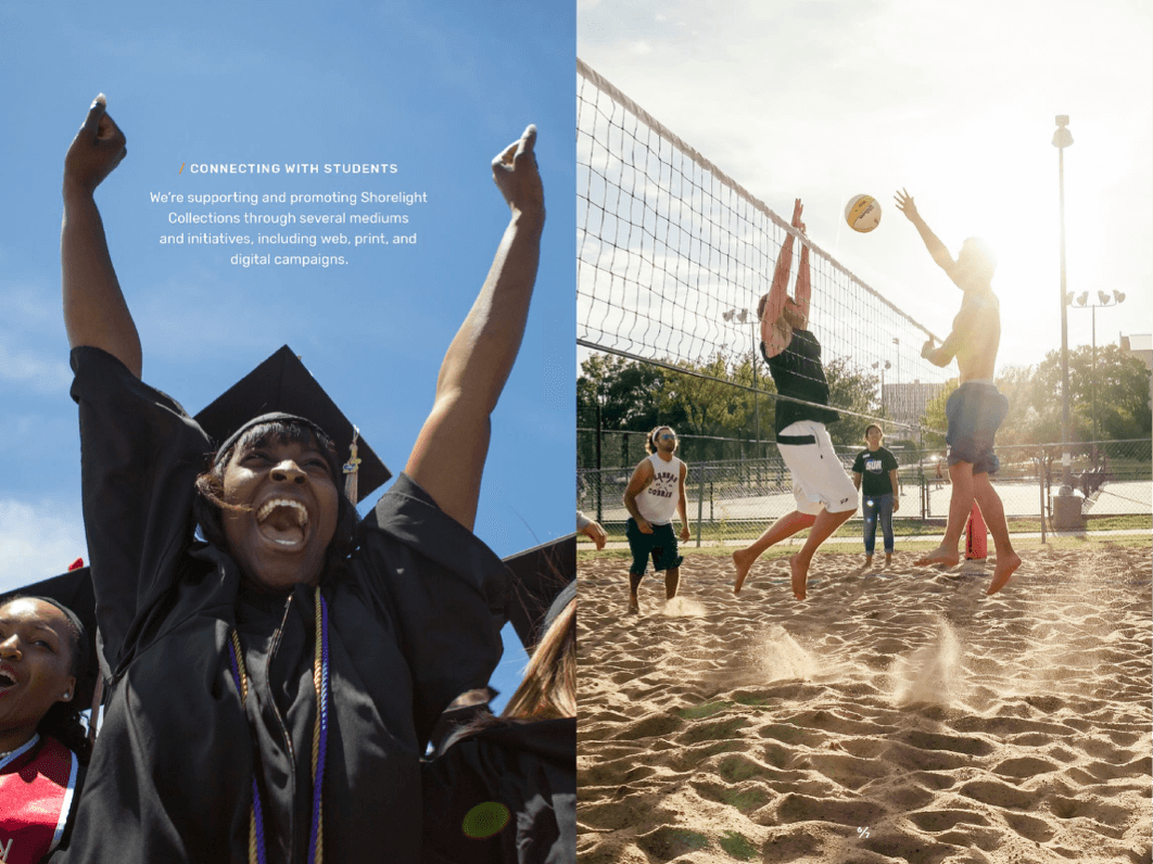
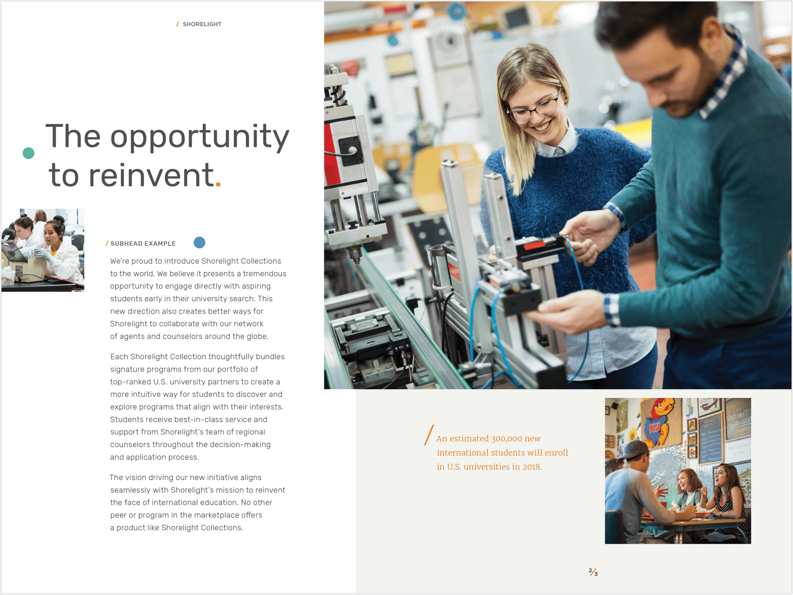
Rubik, medium weight, set in all-caps with generous kerning (ex. +50 optical spacing), can be accompanied by the Shorelight orange slash mark (see graphic elements). Use this style above body text or as section running heads.
body copy
To ensure legibility of large areas of body text, use Rubik Light or Regular with generous leading (ex. 10/16) and surrounded by ample amounts of white space.
callouts
Merriweather, set in the Shorelight orange, is ideal for callouts, pull quotes, and data points. Merriweather should be used sparingly as page/screen accents and should not take prominence over Rubik.

Examples of use